Designing an effective signup screen is crucial for turning visitors into active users. A thoughtfully structured experience can be the difference between a lost lead and a new customer. By minimizing friction, prioritizing user experience, and adopting modern strategies, you can create forms that feel seamless and inviting. For those looking to refine their approach, exploring a signup page design gallery can offer practical inspiration on how to simplify flows, reduce drop-offs, and improve overall conversion rates.
Signup pages are often the first impression users have of your product or service. A seamless experience starts with understanding user expectations, optimizing every step for ease of use, and ensuring trust is established from the outset. Incorporating proven best practices leads not only to increased conversion rates but also to greater long-term satisfaction and loyalty.
Modern signup forms benefit from user-centered design principles, visual clarity, and accessibility across devices. Addressing user needs without unnecessary barriers can dramatically improve conversion rates. Understanding and applying industry benchmarks ensures your signup flow remains competitive.
Today’s digital audience expects a process that is not only straightforward but also quick and secure. By leveraging modern frameworks and drawing from established design models, you can tailor your signup process to be both innovative and user-friendly.
Minimalist design in signup forms is about asking for only the information truly required to create an account. Each additional field introduces potential friction, often resulting in fewer completed signups. For example, websites like GitHub have boosted conversion rates simply by keeping their forms limited to essentials like email, password, and username. Minimizing form complexity aligns with the Nielsen Norman Group's principles on user-centered design, which support removing unnecessary elements to prevent overwhelming users.
The shift toward mobile browsing means many users initiate signups from their phones. Designing form fields that are touch-friendly, visible without needing to zoom, and simple to navigate on small screens is now best practice. Market leaders such as Instagram and Uber have effectively prioritized this approach. Their signup forms feature large buttons, clear input fields, and simple progression, ensuring users on any device enjoy a frictionless experience.
Strong call-to-action (CTA) buttons are pivotal on every signup page. Actions like “Create Your Account” clarify the next step, reducing confusion and encouraging completion. The color, size, and phrasing of these buttons should make them stand out while matching the site's visual language. Placing the CTA above the fold and at logical endpoints in the signup process ensures users can act without hesitation, driving a higher completion rate.
Branding and design consistency throughout the signup process reassure users of your credibility. Consistent colors, font styles, and visual patterns tie the experience together, making the page feel professional and trustworthy. A visually coherent journey not only upholds brand identity but also prevents confusion and hesitancy, which often arises from mismatched or unexpected design elements.
Modern signup pages provide immediate feedback when users interact with form fields. Real-time validation flags errors like invalid email addresses or weak passwords as soon as data is entered, rather than waiting for form submission. This reduces user frustration and speeds up the correction process. Real-time feedback is widely recognized as a core usability improvement that boosts the likelihood of successful form submissions, as highlighted by best practices in error feedback on mobile forms.
Of growing importance is the option for users to sign up with their existing social accounts, such as Google, Facebook, or Apple. Social login streamlines the onboard experience and reduces the number of passwords users must manage. However, it is equally critical to offer traditional registration options, since not all users trust or want to connect external accounts due to privacy concerns.
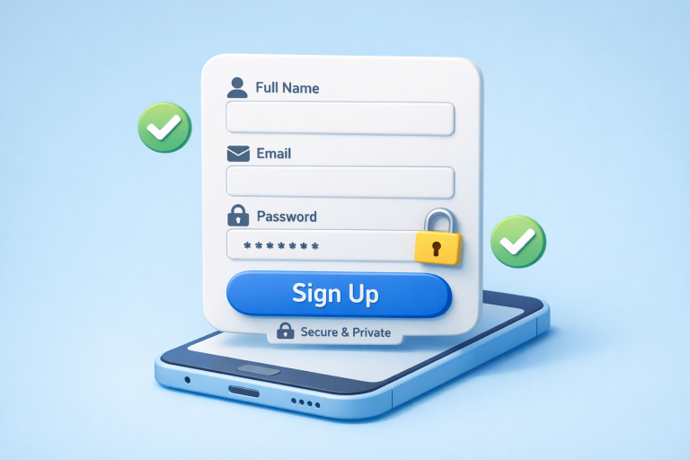
Users want to know that their personal data will be protected. Security features such as SSL encryption, mandatory strong passwords, and clear privacy disclosures boost confidence. Displaying trust signals, such as security certification badges or clear statements about how information will be used and stored, further reassures wary visitors. Proactively addressing user safety with transparent policies directly relates to higher signup rates and increased trust in the brand.
Continuous improvement is necessary for optimal signup performance. A/B testing aspects like button copy, field order, or even the background color can reveal user preferences and increase conversion. Using user behavior analytics allows teams to iteratively refine the signup journey, using real-world data rather than assumptions. As digital competition intensifies, data-driven approaches for ongoing optimization are pivotal for staying ahead.
Adopting these best practices empowers your team to create signup pages that deliver both seamless usability and security. Thoughtful, consistent execution not only attracts new users but also leaves a strong first impression, setting the stage for long-term engagement and satisfaction.

This post has been authored and published by one of our premium contributors, who are experts in their fields. They bring high-quality, well-researched content that adds significant value to our platform.